Feeds:
Posts
Comments

Archive for the ‘Seattle’ Category

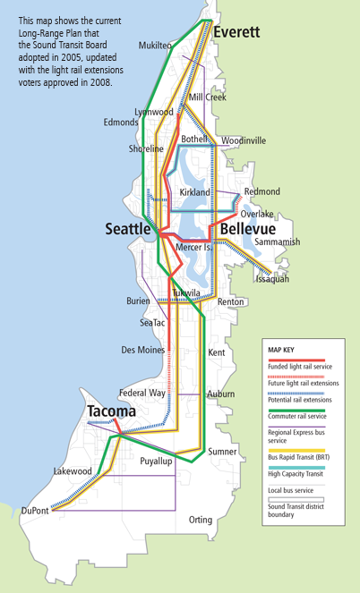
Sound Transit, the Seattle area’s regional transit provider, and the primary planner and builder of rail transit in the region, is updating its Long Range Plan.

I suggest modifying the Long Range Plan Map in three places:

Sound Transit 2005 Long Range Plan Map

Sound Transit 2005 Long Range Plan Map

1. Add a West Seattle potential light rail extension, from downtown Seattle to Burien.  Sound Transit has already scheduled a study of high capacity transit in this corridor.  This link will connect a Hub Urban Village (West Seattle Junction) with downtown Seattle and the Burien regional center, from where the Long Range Plan already shows a potential rail extension.  The transportation geography of West Seattle is particularly favorable for transit ridership.  All travel north or east of the “peninsula” must cross bridges in either the Spokane Street or 1st Av South corridors.  Transit already has a high mode share of downtown commuters due to favorable bus treatment on the West Seattle Bridge and SR 99.  However, the SR 99 tunnel will result in longer travel times and more congestion in the transit path.  Providing a completely grade-separated rail route between West Seattle and downtown will provide attractive, speedy and reliable transit service that will be well utilized.  This project should be considered for the ST3 funding package.

2. Add a potential light rail extension connecting the rail extension in Ballard to the high capacity transit route from Northgate to Bothell.  This connection rationalizes the potential rail extensions into a single line from downtown Seattle to Bothell via Ballard and Lake City.  This addition will connect the Hub Urban Villages of Ballard and Lake City to the Urban Center of Northgate.  This project should be considered for funding in the ST4 or future funding packages.

3. Change the line paralleling I-5 between Seattle and Tacoma from Bus Rapid Transit to High Capacity Transit.  High capacity transit is defined in the Long Range Plan as either BRT, light rail or commuter rail, mode to be determined.  This change in designation allows for future consideration of commuter rail in this corridor.  By the mid-21st century, the Puget Sound region should consider a new mainline rail corridor directly connecting Tacoma, Sea-Tac airport and downtown Seattle.  The corridor would be used for a second Sounder commuter rail line (all-day, two-way) and for regional high-speed rail (Cascades).  The line could utilize the I-5 right-of-way from Tacoma to south of Sea-Tac airport, the right-of-way for the proposed SR 509 extension from I-5 into Sea-Tac airport, and a bored tunnel under the airport and continuing underground near SR 99 to meet the BNSF mainline near Boeing Access Road.  This project should be part of a true long-range plan, to be implemented in cooperation with a high-speed rail authority.
Read Full Post »

I am reposting a link to my essay from the last King County Metro budget crisis, since two years have passed, the “temporary congestion reduction charge” is expiring, and Metro is once again planning 17% bus service cuts. 

This time around, however, I don’t support the mainstream rescue plan.  King County getting the option to vote for new transit taxes for $75 million per year, in exchange for several billion dollars in highway expansions, is not a fair exchange.  Metro should walk.  These highways go directly against the State Growth Management Act, Climate change mitigation goals and Vehicle Miles Travelled reduction goals.  Instead I support a King County “Plan B” of forming a Transportation Benefit District to levy a permanent vehicle license fee.

King County Transit, due to declining sales tax revenue, is faced with 17% system-wide cuts over the next 2 years, unless the County Council passes a temporary $20 car tab fee.  My rationale for why this budget-saver should be passed is posted over at the citytank: Dynamic Metropolitan Areas Depend on Transit, So Pass the Congestion Reduction Charge, Please.

Read Full Post »

Seattle is busy building the city.  Over the past year construction cranes have once again dotted the neighborhoods surrounding the urban core, building apartments and office buildings.  There are four city blocks under construction within two blocks of my South Lake Union office.  Local and national media have jumped on the trend.  Nationally, multi-family housing starts have ranged from one-sixth to one-third of the total over the past several decades.  How has the ratio of single-family to multi-family housing starts varied in the Seattle metropolitan area?

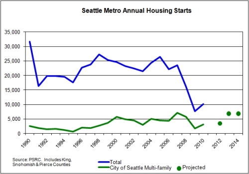
The Puget Sound Regional Council publishes such stats, so I was able to make some charts.  The first chart below shows total housing starts (in King, Snohomish and Pierce Counties) and City of Seattle multi-family starts, over the past 20 years.

During the 1990s, Seattle multi-family averaged at 9% of the total metro housing starts – a pretty small slice of the pie.  During the 2000s, the Seattle multi-family average increased to 23% of the total, and to 30% of the total since 2007.  When the recession of 2008 hit, housing construction tanked.  But single-family construction tanked worse than Seattle multi-family.  And now Seattle multi-family is roaring back to life, while suburban single-family plods along.  The chart includes projections of Seattle multi-family construction based on these articles: it appears that by 2013 multi-family construction in just the City of Seattle could nearly equal 2009 total metro area housing charts.  If suburban home construction continues at the same pace, nearly 50% of the total metro housing starts in 2013 would be apartments in the city.

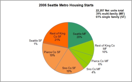
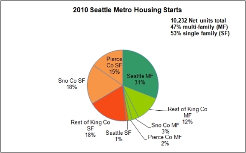
Below are pie charts breaking down the annual housing starts for the Seattle metro in 2006 and 2010.  Notice that the overall pie in 2010 is about half the size, while the Seattle multi-family slice has grown.

Data Source: Puget Sound Regional Council

Data Source: Puget Sound Regional Council

Read Full Post »

On Sunday at this year’s Bumbershoot music festival, Macklemore was the hottest performer.  Fans wearing t-shirts filled the Seattle Center, and began lining up at 4:45 for an 8:00 pm show on the mainstage, the Key Arena. Why is Macklemore, an unsigned rapper, performing in a packed-out Key Arena, capacity 16,641?  It was a coming home party for the #206, a celebration that says we’ve arrived, northwest hip-hop has taken over the palace. While not as polished as the follow-up national act Wiz Khalifa, Macklemore brought local excellence,  musical diversity and most of all, fan devotion.  Yes, the packed-out Key Arena also cheered for Wiz Khalifa, but I saw no Khalifa shirts.  Macklemore didn’t come alone, but brought out Shawn Kemp in a poignant moment of Supersonics nostalgia, DJ/producer Ryan Lewis, a horn section, a string section and a crew of vocalists and dancers.  I’ve never seen a hip hop show with so many instruments on stage, with songs ranging from earnest heartfelt humility like The Town, celebrating the Seattle hip hop community, and the anti-drug the Other Side, to the all-out dance party celebration of Dance and Irish Celebration.  Macklemore represents an emergent local hip hop tradition, fully embraced by the region.  In an age of globalization and homogenization, Seattle (and every other place) needs to nourish our uniqueness and creativity, and build seasoned excellence.  It’s how you build a unique culture, a unique city.

Macklemore_Photo_by_Darin_Chin. Source: Wikimedia

Read Full Post »

On Friday I rode all the rail transit in the Seattle metro area.  It is possible to do this in one day (weekends only) due to the reverse-commute Sound Sounder runs.  Here’s the itinerary:

You can read my running commentary on the trips in my Twitter feed for August 5, 2011.  On the basis of my rides on Friday, I developed a rating matrix of the six rail transit modes, plus Swift BRT.  Three of the vehicles were waiting for me when I arrived at the station: the SLU Streetcar, Central Link and Tacoma Link.  If I hadn’t been so lucky, they would have lower ratings for frequency.   Swift, although it is bus rapid transit not rail, is included as well.  Bus transit, whatever other benefits it provides, simply cannot compete with rail in terms of ride quality.  My return trip from Everett to Seattle via bus was by far more exhausting than the commuter rail trip to Everett.

Service

Frequency

Experience of Speed

Ride Comfort

Ticketing Convenience

Transfer Convenience

Monorail

4

8

7

2

3

SLU Streetcar

6

3

7

6

4

Tacoma Link

8

5

7

10

8

Central Link

8

6

7

7

7

South Sounder

3

9

8

8

7

North Sounder

1

7

8

8

5

CT Swift

3

7

4

7

4

Below is a quantitative comparison of the six rail modes, plus Swift BRT. The surprise to me was the high ridership and frequency of the Monorail – it is actually the best performing rail service in the region. But then, it is by far the oldest (most mature) rail service in the region. Rail is still in its infancy in the Seattle region.

Service

Frequency
(Peak/Base/ Evening)

Average
Speed (mph)

Length
(miles)

Fares

Weekday
Ridership/ Mile

Year
Opened

Monorail

10/10/10

36

1.2

$2.00

3,400

1962

SLU Streetcar

10/15/15

7

1.3

$2.50

2,200

2007

Tacoma Link

12/12/24

12

1.6

Free

1,600

2003

Central Link

7.5/10/10

25

15.6

$2.00-$2.75

1,500

2009

South Sounder

25/–/–
(9 trips)

48

47

$2.75-$4.75

120

2000

North Sounder

30/–/–
(4 trips)

36

35

$2.75-$4.50

20

2004

CT Swift

10/10/20

22

17

$1.75

200

2009

Read Full Post »

King County Transit, due to declining sales tax revenue, is faced with 17% system-wide cuts over the next 2 years, unless the County Council passes a temporary $20 car tab fee.  My rationale for why this budget-saver should be passed is posted over at the citytank: Dynamic Metropolitan Areas Depend on Transit, So Pass the Congestion Reduction Charge, Please.

Read Full Post »

In previous posts I have mapped the population density and household density of the City of Seattle.  The difference between the two maps is household size.  So I also created a map of average household size in the City of Seattle, based on the U.S. Census 2010 data, which I have guest-posted on the  Seattle’s Land Use Code blog.   Go read about it there, but I have included the map below for reference.

Data sources: U.S. Census Bureau, King County GIS, WSDOT

Read Full Post »

It’s been a bit quiet over here at Build the City lately. I ran into trouble with an open-source GIS program, then got busy at work, and then took a two-week vacation to Europe. I will write some observations about the cities I visited in Europe (eventually), but today I saw an article in the Oregonian that caught my attention.

The census tract with the highest population density in the City of Portland shifted between the 2000 and 2010 censuses from NW 21st to the area around PSU.  What is notable is the population density cited for this census tract.  The article uses the strange metric of people/10,000 square feet, but when I do the math it comes out to around 27,000 people/square mile. 

For comparison, Seattle has two entire neighborhoods (Belltown and Capitol Hill) and five census tracts  that exceed this population density.  Seattle’s densest five census tracts are in Capitol Hill (45,000/sq. mi.), Belltown, the U_District and First Hill. 

This article about Portland is typical, because among the three big cities in the Pacific Northwest, Portland is by far the most spread out.   Below is a table that compares the city size and population density among four neighboring cities.

 Notice how the City of Portland takes up almost four times as much space as the cities of San Francisco or Vancouver, yet has a lower population.  Resulting in an average population density less than many suburbs.

Population density of northwest cities over the past 50 years (people/square mile)

Population density matters for Portland, because more people on a given block lead to more customers, which leads to more variety in local services, which leads to a convenient lifestyle on foot or on transit, which leads to building a city.  Portland has only a few neighborhoods where this dynamic has progressed, and therefore many residents find the need to use bicycles to reach daily destinations (2-mile radius).  Portland has the advantage of a consensus around progressive transportation, but it has a long uphill road to sufficiently populate its city.  The City of Portland could house 2,060,000 people at the City of Vancouver’s current density.

Read Full Post »

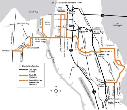
Martin Duke at the Seattle Transit Blog posted a reminder today about Metro Transit Route 50, a historic east-west route between West Seattle and Columbia City. It was proposed to be restored when routes were rearranged for the opening of Link light rail.  It didn’t make the cut.  But there is a detail of Route 50’s routing that stood out to me today.

Instead of following Avalon Way to Spokane Street and crossing the lower bridge, Route 50 would turn down Genesee Street to Delridge Way, then travel north to Spokane.  This slight re-route down is an important concept, as Derek at the Delridge Grassroots Leadership Blog noted.  There would be a minor increase in travel time, for a vast improvement in connectivity.  The North Delridge neighborhood would be directly connected to the Junction, with its supermarkets and wide variety of shops.  Residents from further south on Delridge could transfer to the Junction at shared stops between the 120, 125 and 50.   The Delridge corridor is a virtual retail desert, and transit users in the area find it easier to travel downtown for basic services than to go up to the West Seattle Junction.  They are only one mile apart, but the steep hill and lack of transit routing results in an extreme level of disconnection.

In fact, I have previously dreamed about this same routing for the 22 between the West Seattle Junction and downtown.  I was unsure whether Metro buses could handle Genesee Street’s steep slope, but it must be possible if it made it into Metro’s proposed routing.  Regardless of what happens with Route 50, this Delridge routing should be implemented on Route 22 when routes are revised for Rapid Ride “C.”

Read Full Post »

I have created another map of Seattle’s population density, using units of gross households/acre.  This a measure of the built environment rather than of population, since household sizes can vary with time and between neighborhoods (maybe I’ll make a map of that also).  Net housing units/acre is a commonly used measure in land use planning and zoning, which excludes roadways and non-developable land from the area calculation.  This map is of gross density, incorporating all land, resulting in at least 40% lower density values.   

Only a few hotspots, such as Capitol Hill and Belltown, exhibit greater than 50 units/acre gross (red on the map).  At this level of household density most trips can be taken on foot or via mass transit.  The controversial state bill promoted by Futurewise would have mandated zoning average >50 units/acre net around high capacity transit stations.   A broader section of Seattle’s core has a continuous household density greater than 10 units/acre.  This level of households is associated with robust local bus transit combined with lots of trips via foot or bicycle.  In fact, the orange area on this map corresponds well with my personal experience of the zone in which you can catch a bus on a moment’s notice to go to the next neighborhood, without extensive pre-planning or OneBusAway use.  You are always within two blocks of a bus stop, and a bus is usually coming within a few minutes.

There is a wider swathe of Seattle with 5 to 10 units/acre gross, which generally represent the portions of the city with sidewalks.  While predominately single family homes, these neighborhoods were developed in an era of streetcars and small lots.  Unlike central and north Seattle, the south half of the city is rather inconsistently developed, with a patchwork of low, medium and highly developed areas.

Data sources: U.S. Census Bureau, King County GIS, WSDOT

Read Full Post »

Older Posts »